We all like slick, simple and super clean design, but sometimes when it comes that kind of client, could happen that we’re forced to throw our skills into the trash bin and bend over at the immense power of money or the infinite emptiness of our client’s brain.
If someone doesn’t know what I’m talking about, please take a moment to read this marvellous piece of art that provides a super easy explanation of a designer’s worst nightmare: “How a web design goes straight to hell” by Oatmeal
Someone could think that this is impossibile, that it’s just fiction, a fairy tale used by the elders of the village to scary young designers…but unfortunately everything’s true.
So, what can we do when it comes this kind of shitty job? Stop crying like a baby and try to enjoy the moment with modern technology. So here’s the challenge of this tutorial:
Create this shitty 2000s button in CSS3, and bring back the web2.0 graphic style with the strength of a kick in the nuts
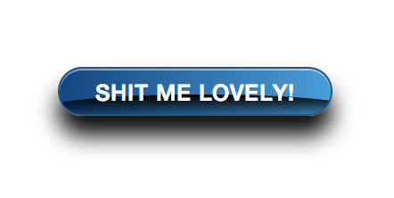
![shitty-button]()
Lets start with the simple HTML code
<div class="btn btn-shit">
   shit me lovely!
   <div class="glare"></div>
</div>
And here it comes the simple CSS based on Bootstrap 3.0, to create the basic structure of a simple and modern flat button
.btn {
  display: inline-block;
  padding: 6px 12px;
  margin-bottom: 0;
  font-size: 14px;
  font-weight: normal;
  line-height: 1.428571429;
  text-align: center;
  white-space: nowrap;
  vertical-align: middle;
  cursor: pointer;
  border: 1px solid transparent;
  border-radius: 4px;
  -webkit-user-select: none;
  -moz-user-select: none;
  -ms-user-select: none;
  -o-user-select: none;
  user-select: none;
}
My heart and my brain are telling me to stop and forget about the last part. The button could be like this, be normal, be modern, be loved by everybody…but no, I will pursue this shitty path and destroy my last drop of hope.
Ladies and gentlemen, here comes the shitty code to destroy your dignity:
.btn-shit {
  height: 55px;
  border: 2px solid #25567a;
  color: #fff;
  text-transform: uppercase;
  font-size: 25px;
  font-weight: 500;
  border-radius: 30px;
  letter-spacing: 1px;
  padding: 10px 40px;
  box-shadow: 0 22px 40px rgba(0, 0, 0, 0.95), inset 0 2px 0px rgba(255, 255, 255, 0.5);
  overflow: hidden;
  background: #15487f;
  background: -moz-linear-gradient(left, #15487f 0%, #479fd6 100%);
  background: -webkit-gradient(left top, right top, color-stop(0%, #15487f), color-stop(100%, #479fd6));
  background: -webkit-linear-gradient(left, #15487f 0%, #479fd6 100%);
  background: -o-linear-gradient(left, #15487f 0%, #479fd6 100%);
  background: -ms-linear-gradient(left, #15487f 0%, #479fd6 100%);
  background: linear-gradient(to right, #15487f 0%, #479fd6 100%);
  filter: progid:DXImageTransform.Microsoft.gradient( startColorstr='#15487f', endColorstr='#479fd6', GradientType=1 );
  line-height: 1.33;
}

.btn-shit .glare {
  width: 150%;
  margin-left: -22%;
  margin-top: -14px;
  z-index: 2;
  height: 28px;
  border-radius: 50%;
  background: rgba(0,0,0,1);
  background: -moz-linear-gradient(top, rgba(0,0,0,1) 0%, rgba(0,0,0,0.49) 51%, rgba(0,0,0,0) 100%);
  background: -webkit-gradient(left top, left bottom, color-stop(0%, rgba(0,0,0,1)), color-stop(51%, rgba(0,0,0,0.49)), color-stop(100%, rgba(0,0,0,0)));
  background: -webkit-linear-gradient(top, rgba(0,0,0,1) 0%, rgba(0,0,0,0.49) 51%, rgba(0,0,0,0) 100%);
  background: -o-linear-gradient(top, rgba(0,0,0,1) 0%, rgba(0,0,0,0.49) 51%, rgba(0,0,0,0) 100%);
  background: -ms-linear-gradient(top, rgba(0,0,0,1) 0%, rgba(0,0,0,0.49) 51%, rgba(0,0,0,0) 100%);
  background: linear-gradient(to bottom, rgba(0,0,0,1) 0%, rgba(0,0,0,0.49) 51%, rgba(0,0,0,0) 100%);
  filter: progid:DXImageTransform.Microsoft.gradient( startColorstr='#000000', endColorstr='#000000', GradientType=0 );
}
Bonus shit!
Just because I’m kind and I know that if you’ve reached this point, you deserve an adeguate reward. Let’s add some rollover effect to our poor button
.btn-shit:hover, .btn-shit:focus {
  color: #fff;
  text-decoration: none;
  background: #2273A8;
  background: -moz-linear-gradient(left, #2273A8 0%, #009DFF 100%);
  background: -webkit-gradient(left top, right top, color-stop(0%, #2273A8), color-stop(100%, #009DFF));
  background: -webkit-linear-gradient(left, #2273A8 0%, #009DFF 100%);
  background: -o-linear-gradient(left, #2273A8 0%, #009DFF 100%);
  background: -ms-linear-gradient(left, #2273A8 0%, #009DFF 100%);
  background: linear-gradient(to right, #2273A8 0%, #009DFF 100%);
  filter: progid:DXImageTransform.Microsoft.gradient( startColorstr='#2273A8', endColorstr='#009DFF', GradientType=1 );
}
Now, go get a shower and forget about this!